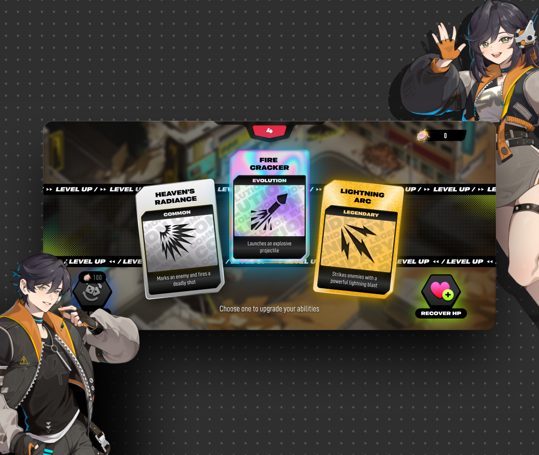
Rampage Game Quest
A daily-quest and rewards HUD for a mobile action RPG, redesigned so claiming a reward reads as a payoff, not paperwork.
Visit argus.gg- Client
- Sector
- Role
- Team
- Period
- Surface
Overview
Rampage Game Quest hands out two currencies, five-plus reward types and a difficulty ladder before a player finishes their first run. The quest panel is where all of that has to resolve into three things: what to do next, what it's worth, and how to claim it.
Scope
- 01Competitive teardown
- 02Quest & reward taxonomy
- 03Currency & economy mapping
- 04User flows
- 05Wireframes
- 06Interface design
- 07Iconography direction
- 08Reward & claim states
- 09Prototyping
- 10Design QA
Problem
Every icon needed a tooltip that didn't exist.
Four quest cards, two currencies, five reward icons and a difficulty label all sat on one screen with no way to ask what any single piece meant. A player could see “+150” next to a gem icon and a coin icon in the same breath and have no way to tell which one mattered for the gear they actually wanted.
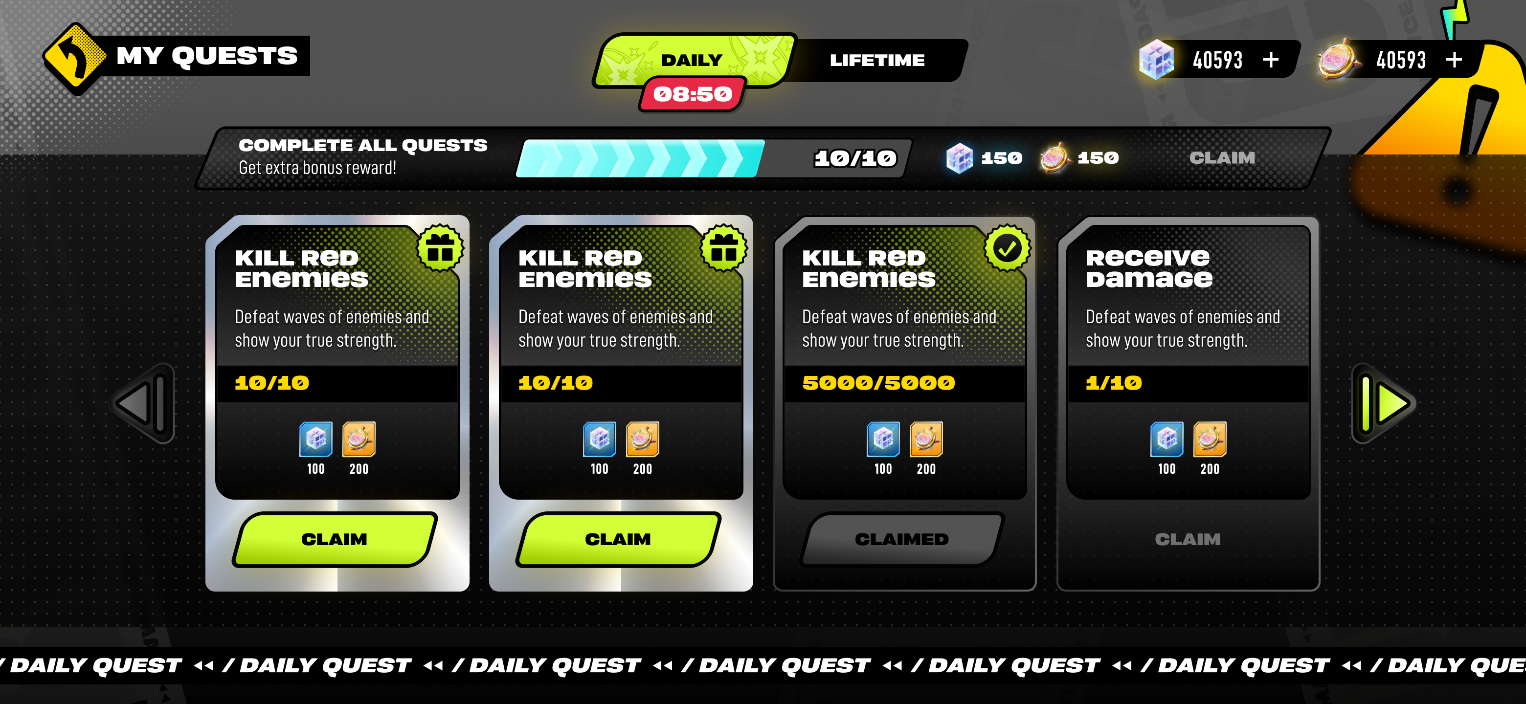
Claimed, claimable and locked cards used the same card shell with only a label change, so a full row of grey “Claimed” buttons read as broken, not finished. Reward-drop screens were bolted on afterward as their own modal, so opening one meant losing the quest list underneath it.
Approach
State does the explaining, not a label.
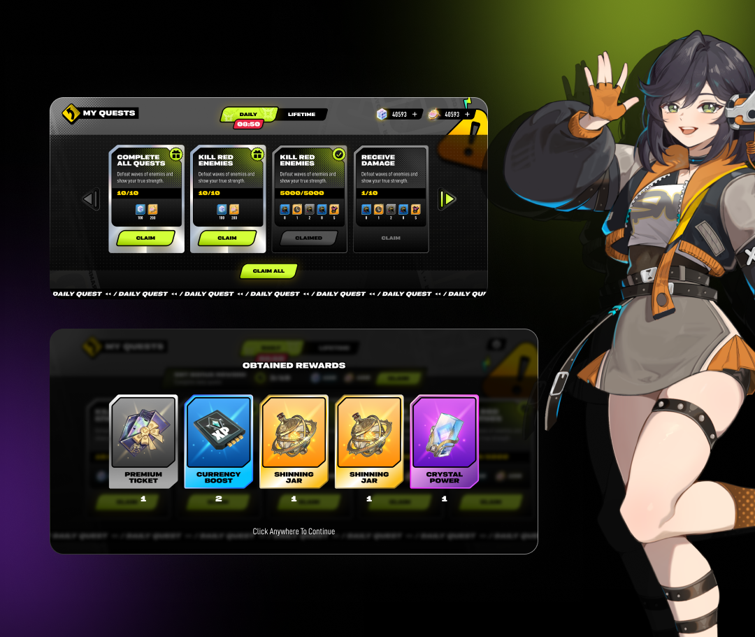
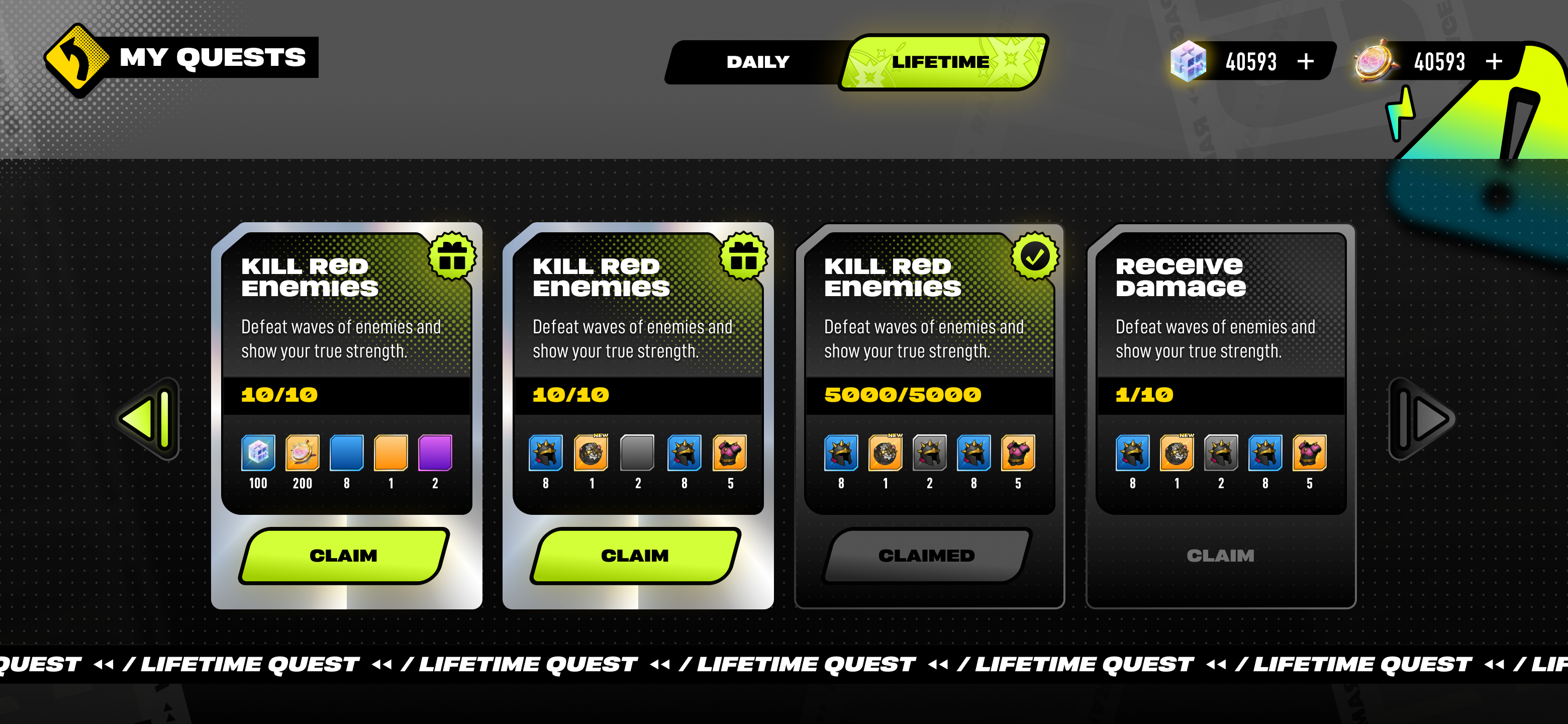
Every quest card carries its state in colour and shape before a player reads a word: a lit green Claim button, a greyed Claimed shell, a progress track that fills left to right. Daily and Lifetime share one card language behind two tabs, so switching between them never feels like a different screen.
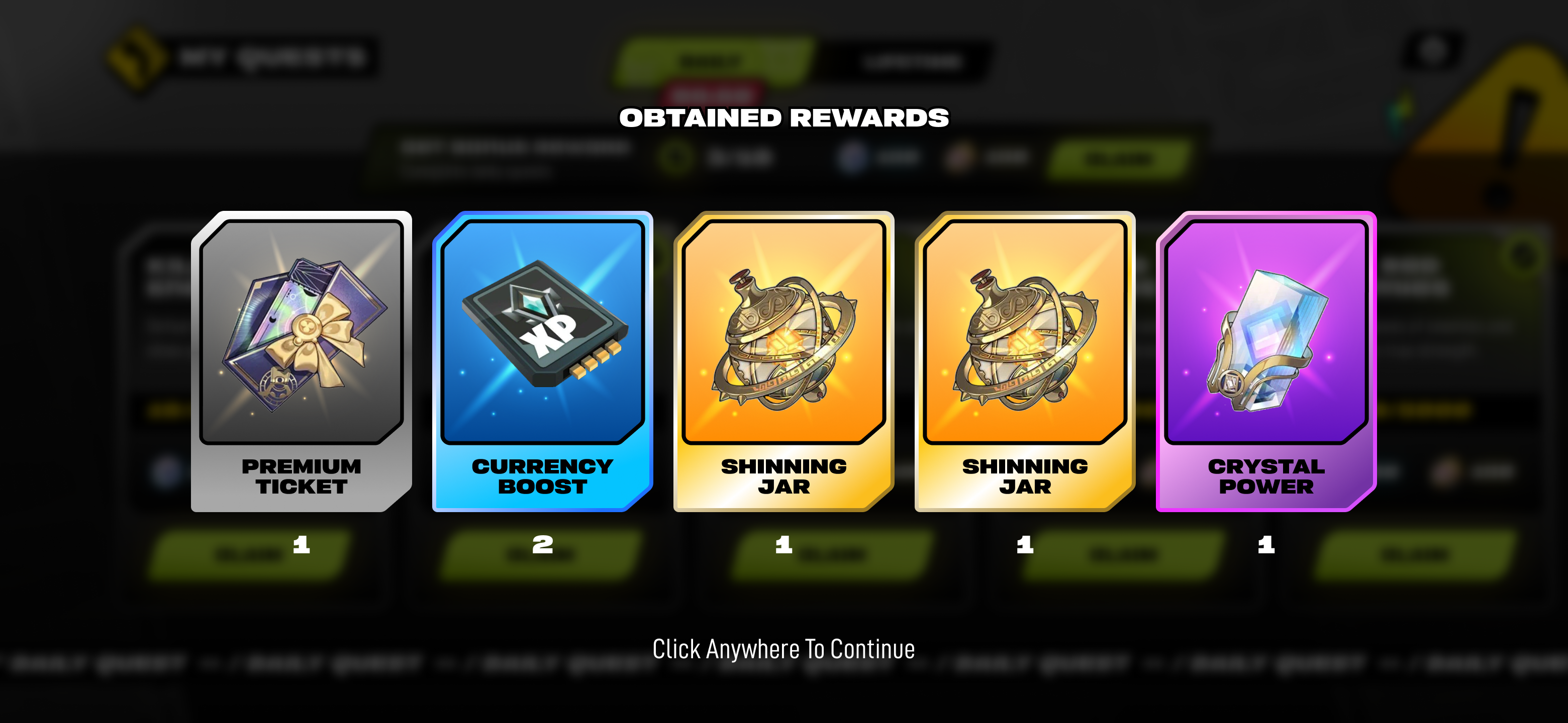
Claim All sits under the row for the moment every card is already lit, because asking someone to tap four identical buttons in sequence is the app re-counting what the player already counted. Obtained Rewards opens as a full-screen pause between claiming and getting back to the run, so five drops land as one moment, not four missed toasts.
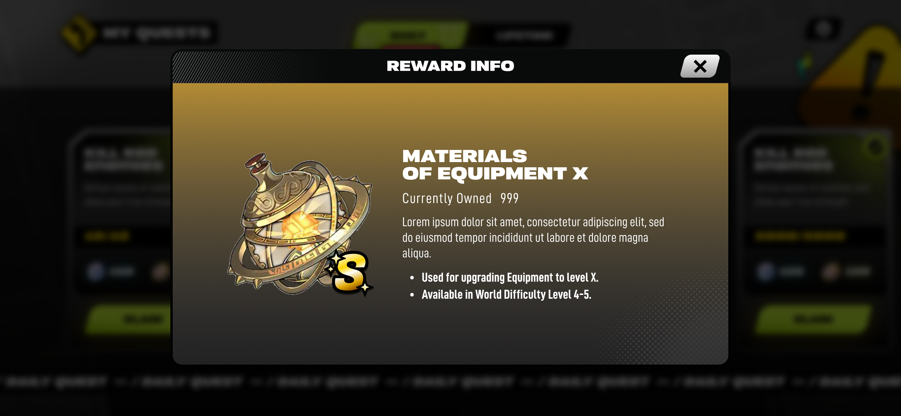
Every reward icon opens the same Reward Info card on tap: name, amount owned, what it's for, where to farm more. One pattern answers every “+2 Shinning Jar, so what” question the raw HUD couldn't.
Screens
Results
Deliverables