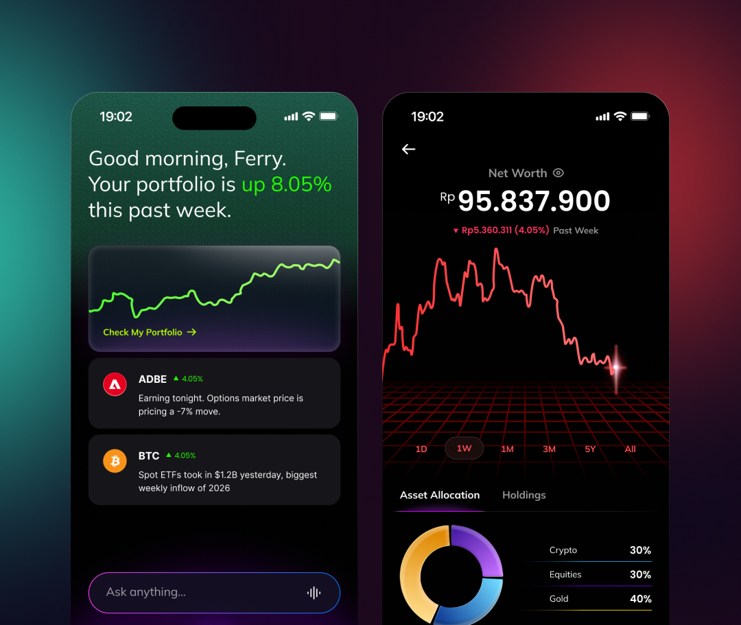
Nanovest Investment App
A guided first session and a shorter path to a first trade: fewer steps after login, and two ways in from the same home screen, explore assets or invest right away.
Visit nanovest.io- Client
- Sector
- Role
- Team
- Period
- Surface
Overview
Nanovest wanted fewer steps between signing in and a first trade, and a home screen that never leaves a brand-new investor guessing what to do next. So the home carries two ways in at once: explore everything first, or go straight to buying, instead of forcing one path on everyone.
Scope
- 01Stakeholder interviews
- 02Competitive teardown
- 03Onboarding flow
- 04Information architecture
- 05User flows
- 06Wireframes
- 07Interface design
- 08Empty & zero-balance states
- 09Prototyping
- 10Design QA
Problem
A new account had a dashboard, not a guide.
Signing in dropped every investor into the same screen, with no path forward for the one that mattered most: an account that owned nothing yet. The layout assumed a decision had already been made (what to buy, how much, in which asset class) when the real first question was simpler: where do I even start?
Getting to a first purchase took more taps than it needed to, each one an unguided decision with no default. Nothing on the home screen said start here, so first-time investors either stalled before their first trade or wandered through menus built for someone who already knew what they were doing.
Approach
Two ways in, decided from one screen.
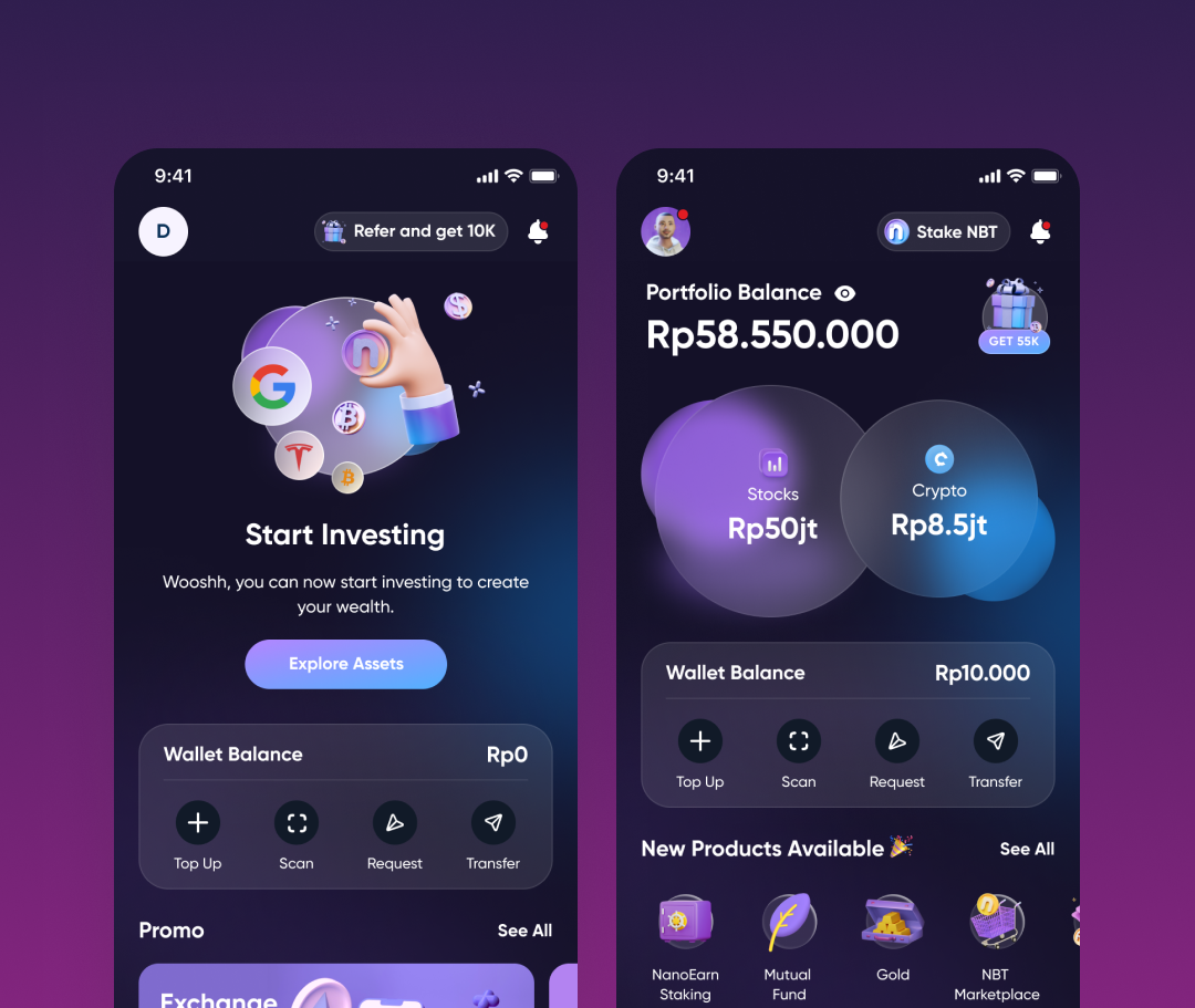
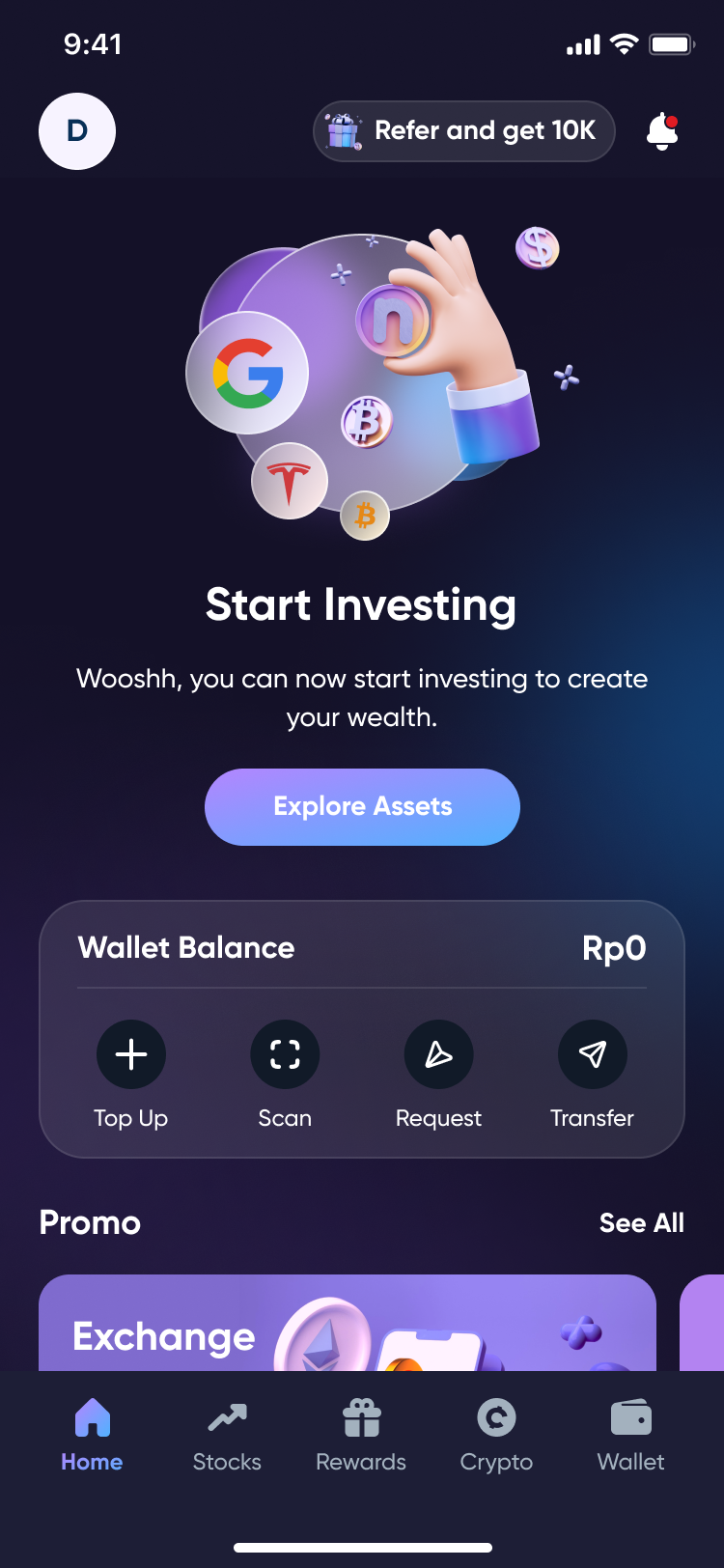
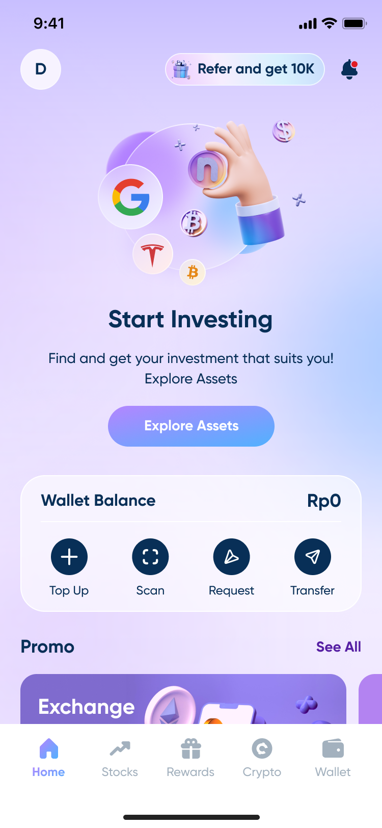
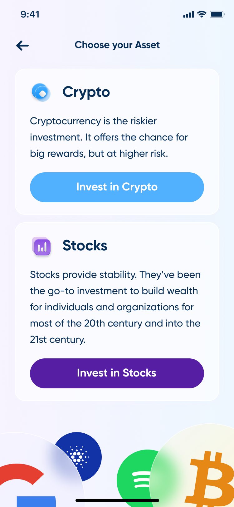
A first session reduces to one screen and one choice: Explore Assets, for someone who wants to look around first, or a direct Invest in Crypto / Invest in Stocks button, for someone who already knows what they want. Neither path is the only way in; both start from the same home.
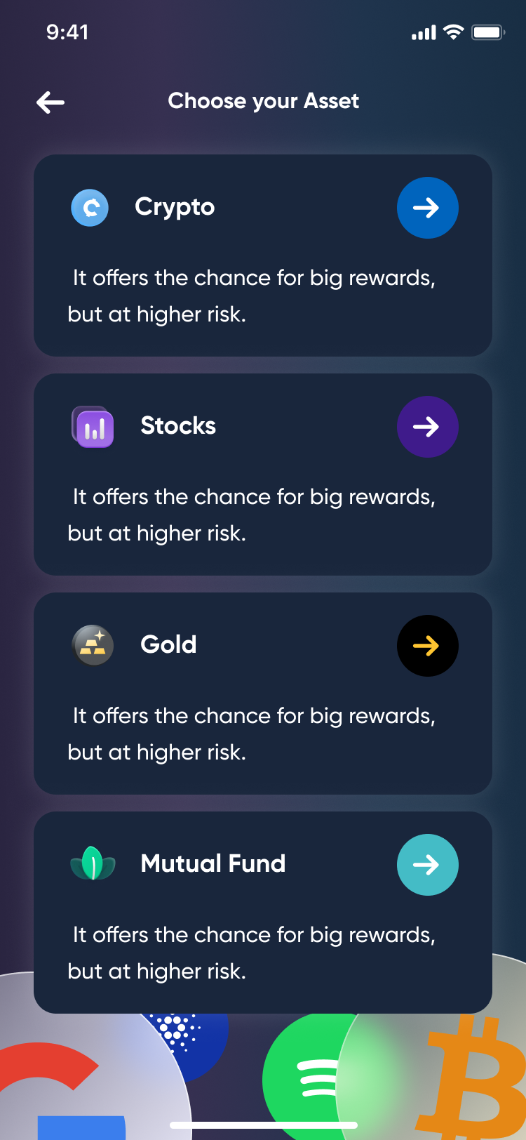
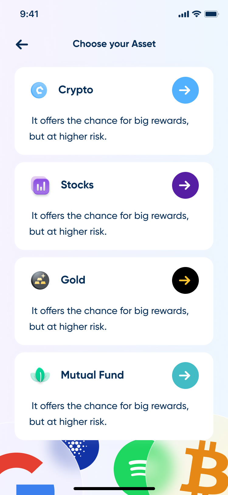
Explore Assets opens a guided list (Crypto, Stocks, Gold, Mutual Fund), the same one-line pitch and a single tap forward on each, so browsing never turns into research. Going straight to an asset class instead opens a two-card picker, one paragraph of context per class, one CTA each; the decision gets made once, before any screen asks for an amount.
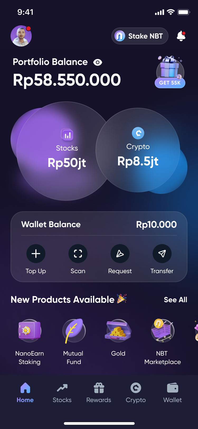
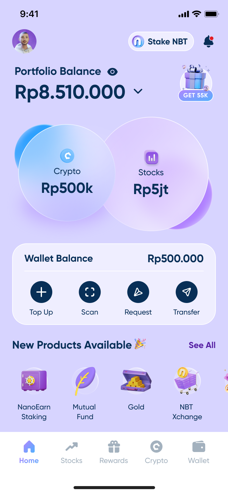
Once an account actually holds something, Stocks and Crypto become two bubbles instead of one summed number, sitting above a Wallet Balance row (Top Up, Scan, Request, Transfer) that holds its position whether the portfolio counts five instruments or none. The guide doesn't disappear the moment someone becomes an investor; it just changes shape.
Screens

Results
Deliverables