Amazon Checkout Redesign
Four checkout screens that let someone switch delivery speed, recognize a card by its logo, and see the whole bill before a single tap commits them to it.
Visit amazon.com- Client
- Sector
- Role
- Team
- Period
- Surface
Overview
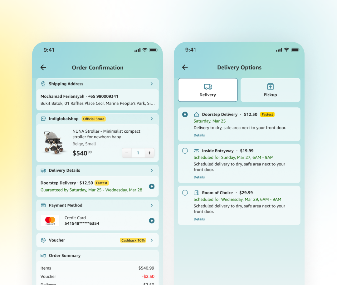
Amazon's own checkout works, but six small frictions keep resurfacing in it: a delivery choice that locks in too early, a summary that shows a total with no math behind it, a payment method that reads as plain text instead of a recognizable card. A concept redesign that rebuilds the same four steps, address, delivery, payment, review, around one rule: nothing is confirmed until its consequence is already visible.
Scope
- 01Flow audit
- 02Competitive teardown
- 03Information architecture
- 04User flows
- 05Wireframes
- 06Interface design
- 07Microcopy
- 08Accessibility pass
- 09Prototyping
Problem
Six small frictions, never solved as one flow.
Delivery locked in early: switching from delivery to pickup, or changing the shipping speed, meant abandoning the order and starting over. The order summary showed a single total with no breakdown, so items, voucher, and delivery fee were impossible to check against each other before paying.
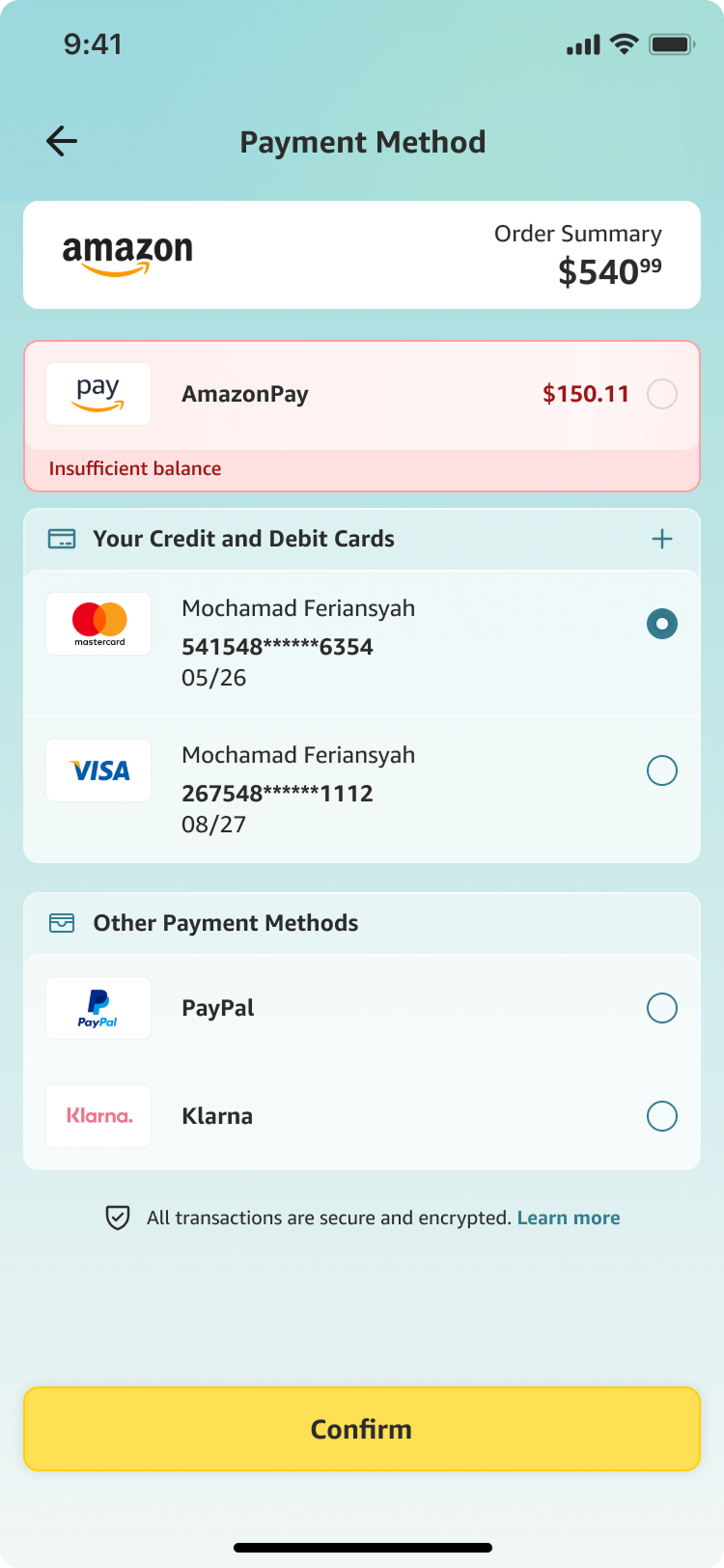
Quantity lived in a dropdown, one extra tap for a change most people make more than once. Saved cards showed as a masked number and a name, nothing that read as Visa or Mastercard at a glance, and payment carried no visible reassurance that a transaction was safe, no line about encryption, right where trust actually gets decided.
Approach
Four screens, one modular flow, each doing one job.
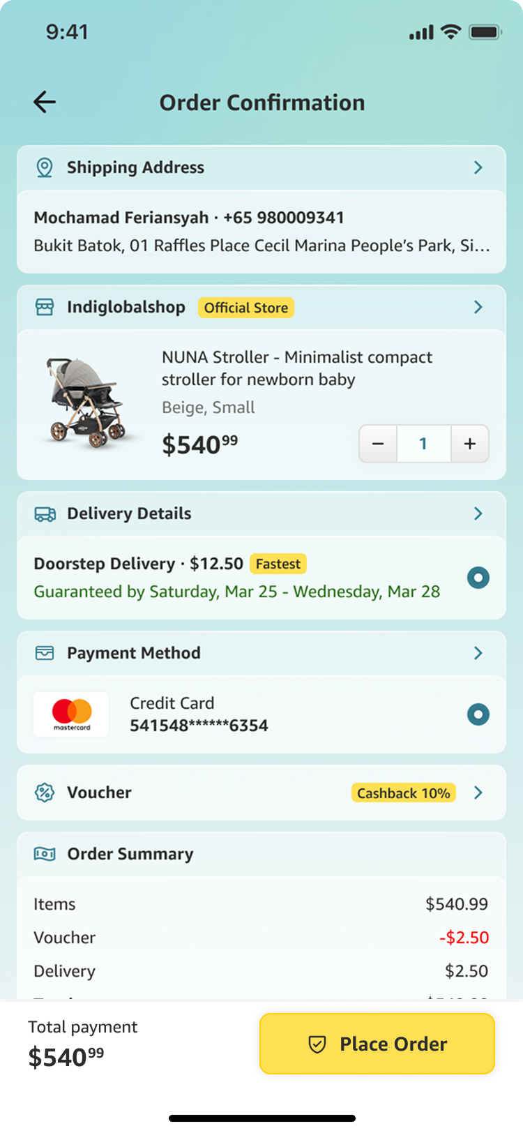
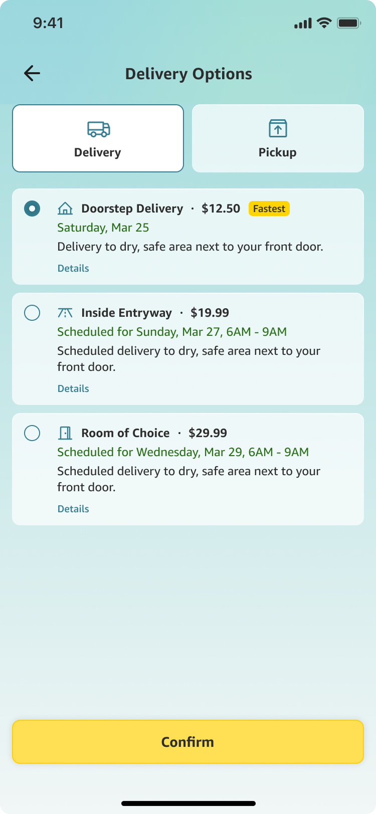
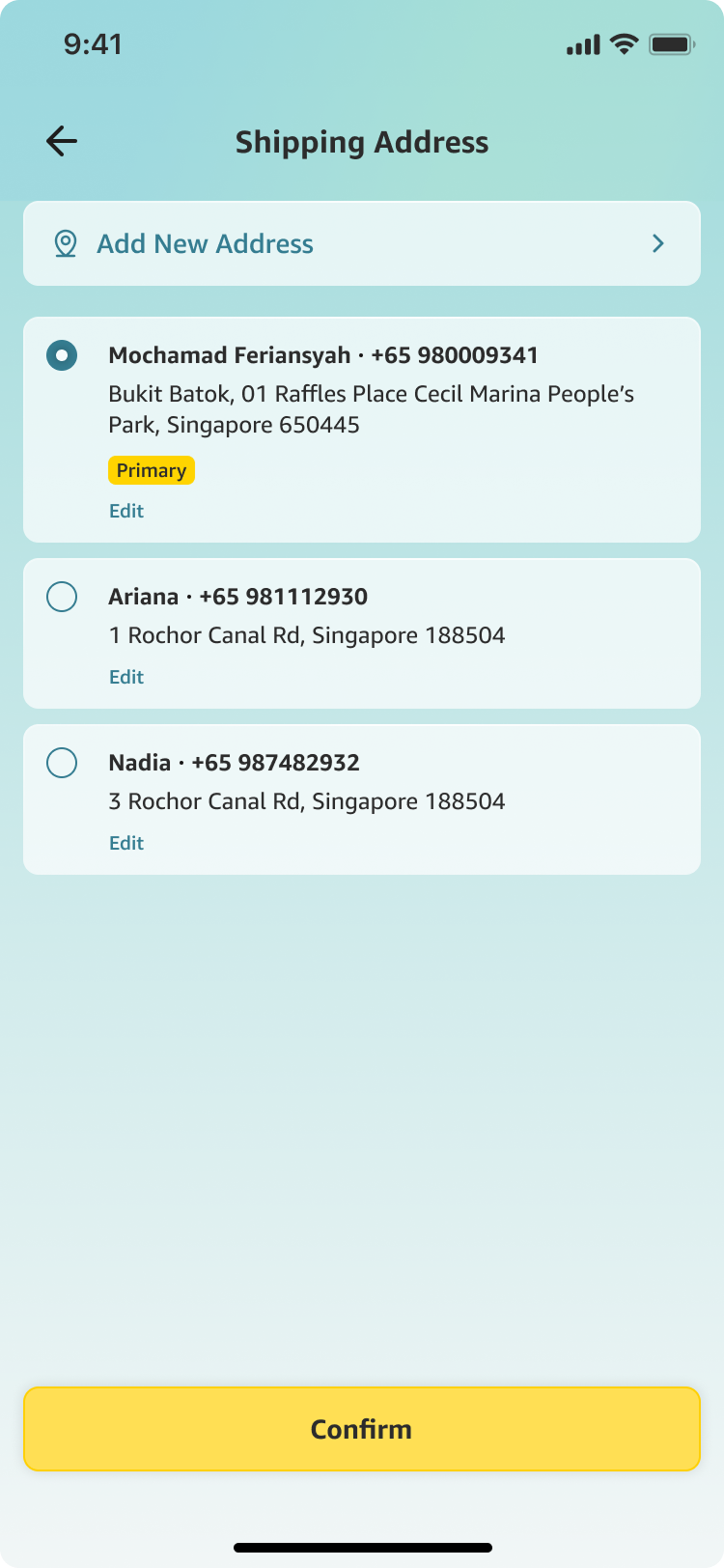
Address, delivery, payment, and review split into four screens instead of one long form, so switching delivery to pickup, or a card to PayPal, means returning to that one screen, not restarting the order. The review screen keeps every section tappable back to its source screen for exactly that reason.
The order summary breaks into items, voucher, and delivery before it shows a total, and quantity is an inline stepper next to the item itself, not a menu two taps away. Every saved card and wallet carries its own logo, Mastercard, Visa, PayPal, Klarna, so recognizing which one is selected takes a glance, not a read.
A single line under the payment methods, all transactions are secure and encrypted, sits exactly where the decision to pay gets made, not buried in a footer or a help article three taps away.
Screens
Results
Deliverables