Game Interface Study
A brand identity and HUD system for Hunters: Legend of Heroes, an imaginary magitech MOBA designed for Argus Labs to read as competitive without reading as intimidating.
Visit argus.gg- Client
- Sector
- Role
- Team
- Period
- Surface
Overview
Argus Labs, the studio behind World Engine, asked for a brand and UI exploration of an imaginary MOBA: something stylised enough to read as premium, without losing the clarity a health bar or a minimap needs mid-fight.
Scope
- 01Competitive teardown
- 02Brand identity & colour system
- 03Typography direction
- 04Information architecture
- 05Wireframes
- 06Interface design
- 07HUD & overlay design
- 08Mini design system
- 09Prototyping
- 10Design QA
Problem
Most MOBA interfaces read as either too casual or too cluttered, and Hunters had to be neither.
Argus Labs asked for a UI and brand exploration for Hunters: Legend of Heroes, an imaginary magitech MOBA, sitting in a genre where interfaces tend to split into two failure modes: casual titles that read as too thin for a competitive player, and hardcore titles so dense with HUD elements that a new player bounces before their first match ends.
The brief carried a second tension: a midcore audience wants the visual depth of a hardcore title but won’t tolerate the onboarding cost of one, so every screen, from the lobby to the health bar, had to read as competitive without reading as intimidating.
Approach
A magitech identity built from three references, then carried into every HUD element.
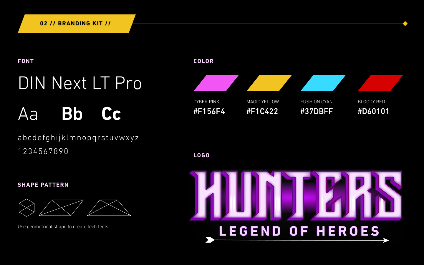
The visual language borrows Cyberpunk’s colour palette, DOTA’s layout and hierarchy, and Heroes of the Storm’s team-oriented framing, then binds them with a four-colour brand palette, Cyber Pink, Magic Yellow, Fusion Cyan and Bloody Red, geometric shapes and DIN Next LT Pro type for the tech half of magitech, glowing edges and the Hunters logotype for the magic half.
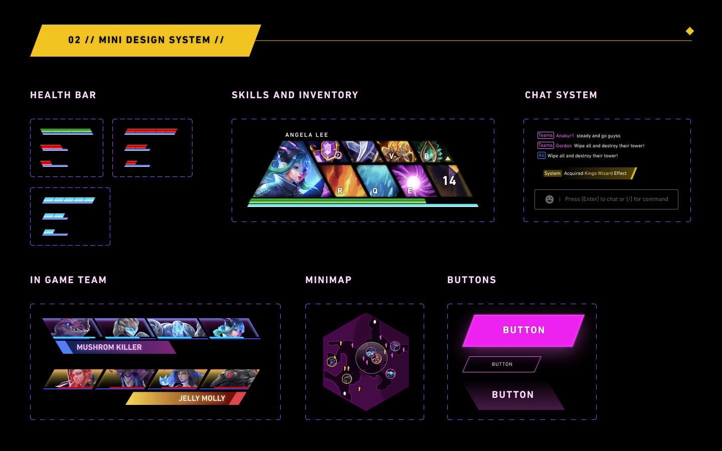
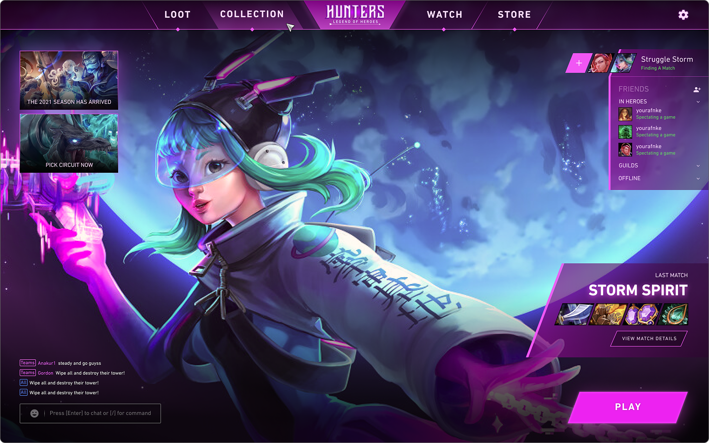
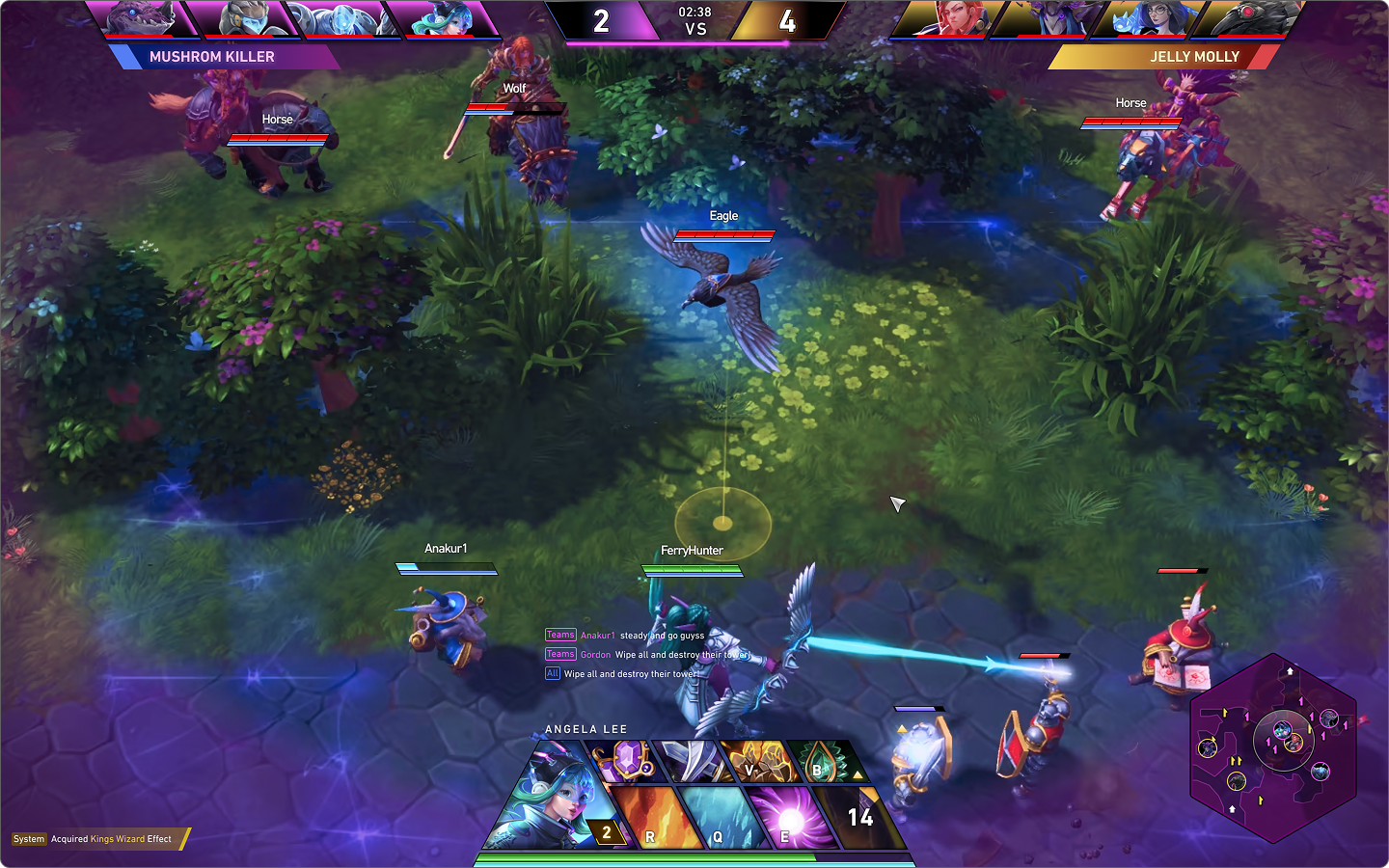
A mini design system, health bar, skills and inventory, chat, in-game team banner, minimap, buttons, keeps every one of those elements consistent whether it shows up in the lobby chrome or over live gameplay.
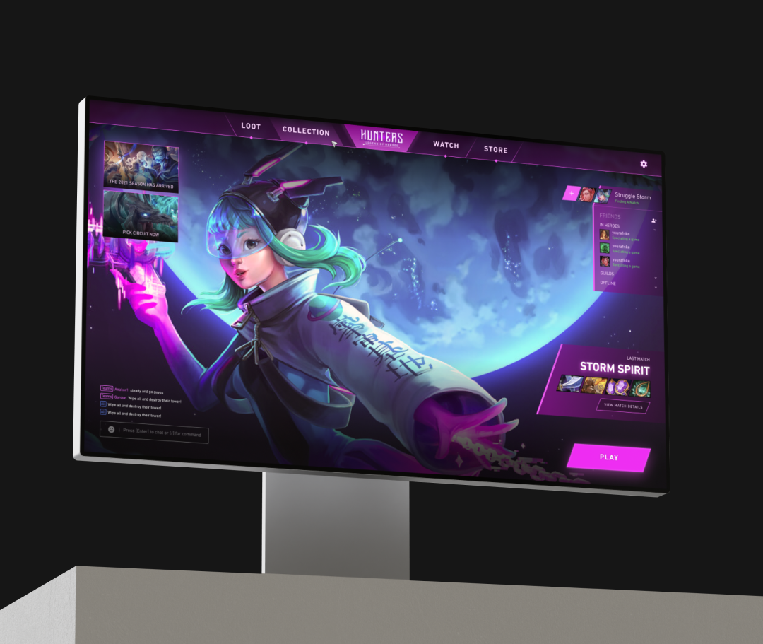
That identity gets tested against the interface it actually runs inside: a lobby where Play stays the one filled action beside a friends list, guilds and a last match card, and a battle HUD where health, mana, a minimap, a skill and inventory panel, team banners and chat all read at a glance.
Screens
Results
Deliverables